Stique
About
Stique (from ‘domestique’) is a Midlands-based cycling accessories startup that makes high-quality products using engineering-grade materials. I designed and built Stique’s website, developed its brand guidelines, and designed its packaging along with an array of other branded materials.
Work Performed
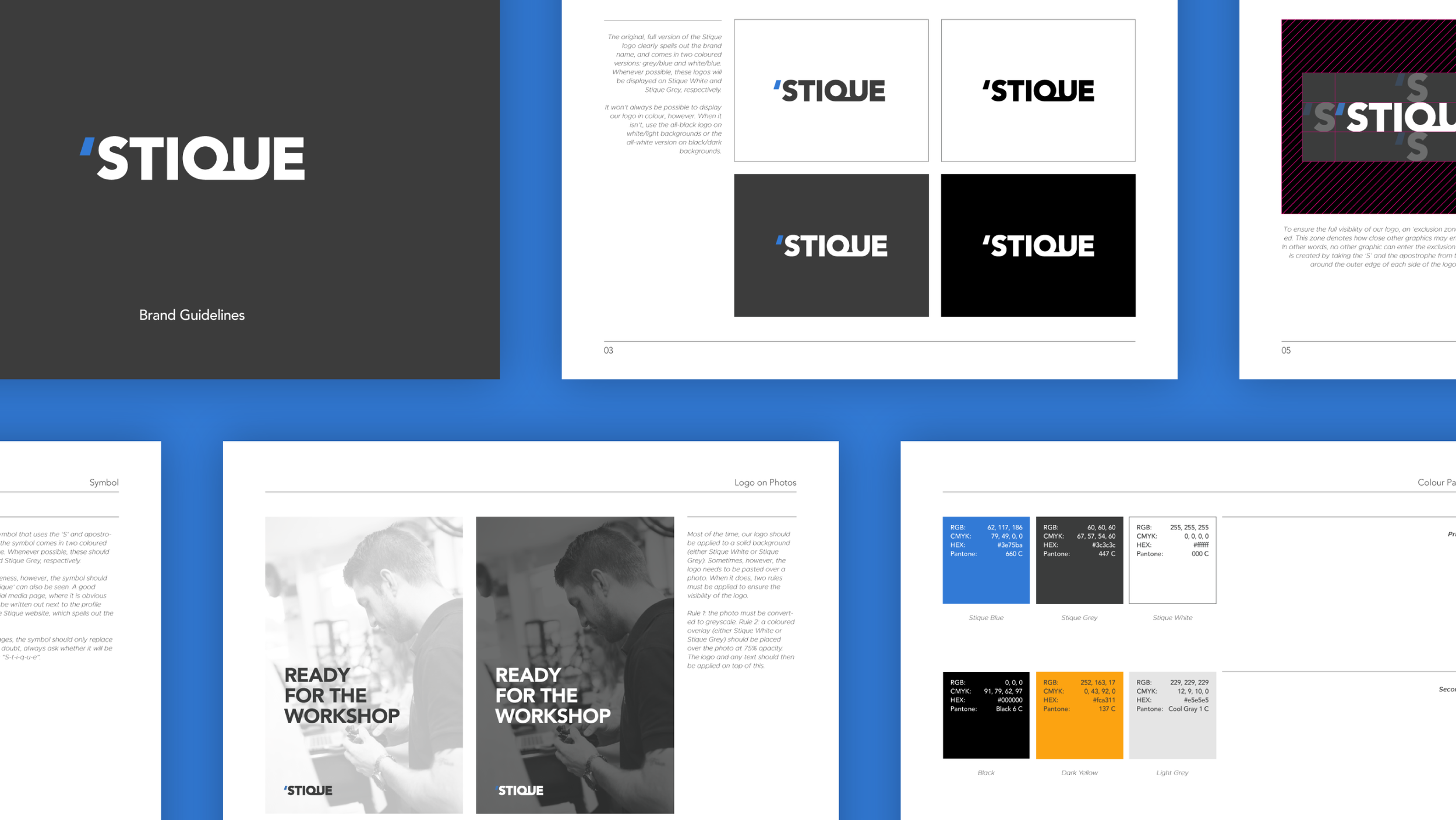
Step 1 for Stique was a set of brand guidelines that could be used by the business to ensure visually coherency across its many brand touchpoints. Guidelines included instructions on logo usage, colours, typography, material layouts, and imagery.
Using this newly established visual language, I went on to redesign and rebuild Stique’s website. This was done on Shopify, whose advanced e-commerce capabilities and seamless integration with third-party apps (e.g. Mailchimp, Xero) made it the right fit for this particular business.
Given the nature of the business and competitor landscape, Stique’s packaging was identified as a potential source of differentiation / competitor advantage. In keeping with the company’s design philosophy, I designed simple, clean packaging for three of its main products: the ML125, ML125CF, and ML14CF, and handled production with the printers.
Over an extended period of time, I have also designed a number of other branded materials for the company, including business cards, promotional materials, and social media content.
Brand Guidelines
Website Design
Website Development
Packaging Design
Business Card Design
Poster Design


